Flutter: Toggle Password Visibility

You might have seen an eye button that toggles the password visibility in Signup or Login forms on various websites. This button is important since there are many criteria to be followed while setting a password, so we might need to see if our password matches the pattern. This feature is quite popular and can be added to Flutter App as well.
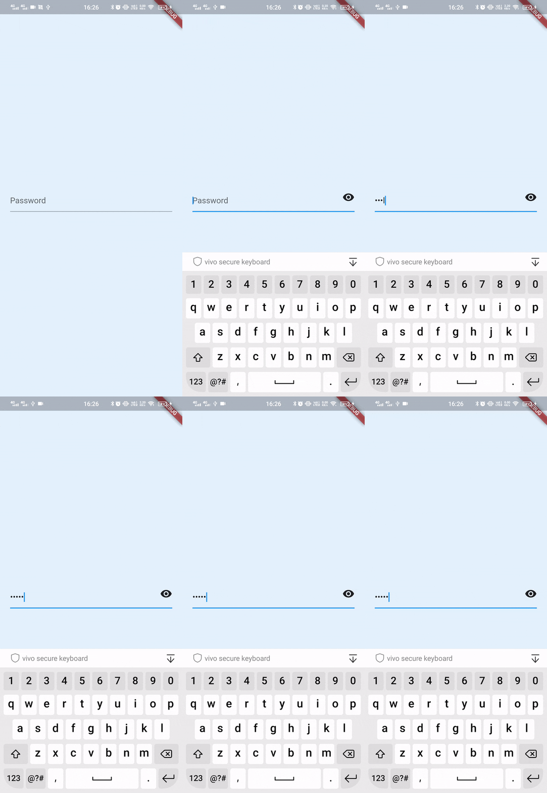
Let's look at the final output first to have an idea about what we are going to build :
Get Started
We will be starting right from scratch. First, we are going to create a flutter project and remove all the boilerplate code from the main.dart file. We are not going to add a lot of things in this app. We'll just have a screen with a password field.
So, here is my main.dart file :
import 'package:flutter/material.dart';

class LoginForm extends StatefulWidget {
  @override
  _LoginFormState createState() => _LoginFormState();
}

class _LoginFormState extends State<LoginForm> {
  bool _isHidden = true;

  @override
  Widget build(BuildContext context) {
    return Scaffold(
      backgroundColor: Theme.of(context).secondaryHeaderColor,
      body: Center(
        child: Padding(
          padding: const EdgeInsets.all(20.0),
          child: TextField(
            obscureText: _isHidden,
            decoration: InputDecoration(
              hintText: 'Password',
              suffixIcon: GestureDetector(
                onTap: _togglePasswordView,
                child: Icon(
                  _isHidden ? Icons.visibility : Icons.visibility_off, // Add this line
                ),
              ),
            ),
          ),
        ),
      ),
    );
  }

  void _togglePasswordView() {
    setState(() {
      _isHidden = !_isHidden;
    });
  }
}
You will get two errors in this file and both will be fixed in next step. We will fix them by creating a new file (login.dart) which will contain LoginForm Widget code. You can ignore them for now.
Adding Login Form
In this step, we are going to create a login.dart file which will contain a Stateful Widget called LoginForm. This will be a simple widget and will just contain a Password Input Field and Toggle Button.
Password Field has an argument called obsecureTextthat hides the password visibility if set to true. The default value is false
Let's start by creating a login.dart file first and adding the below code :
import 'package:flutter/material.dart';

class LoginForm extends StatefulWidget {
  @override
  _LoginFormState createState() => _LoginFormState();
}

class _LoginFormState extends State<LoginForm> {
  bool _isHidden = true;

  @override
  Widget build(BuildContext context) {
    return Scaffold(
      backgroundColor: Theme.of(context).secondaryHeaderColor,
      body: Center(
        child: Padding(
          padding: const EdgeInsets.all(20.0),
          child: TextField(
            obscureText: _isHidden,
            decoration: InputDecoration(
              hintText: 'Password',
            ),
          ),
        ),
      ),
    );
  }
}
In the above code, we have just created a TextField and set the obsecureText argument to _isHidden. _isHidden is boolean variable set to true by default.
Adding Toggle Button
Next, we are going to add the toggle button to change the visibility of the password. We can do this easily using the suffixIcon property in InputDecoration. This will add an icon at the end of the input field.
import 'package:flutter/material.dart';

class LoginForm extends StatefulWidget {
  @override
  _LoginFormState createState() => _LoginFormState();
}

class _LoginFormState extends State<LoginForm> {
  bool _isHidden = true;

  @override
  Widget build(BuildContext context) {
    return Scaffold(
      backgroundColor: Theme.of(context).secondaryHeaderColor,
      body: Center(
        child: Padding(
          padding: const EdgeInsets.all(20.0),
          child: TextField(
            obscureText: _isHidden,
            decoration: InputDecoration(
              hintText: 'Password',
              suffixIcon: Icon(Icons.visibility),   // Add this line
            ),
          ),
        ),
      ),
    );
  }
}
Adding Gesture Detector
In this step, we will make the icon clickable so that when the user clicks on it, it hides or shows the password. This is where the real logic comes. We will be using a method to toggle the password visibility, i.e., changing the obsecureText from true to false and vice-versa easily.
import 'package:flutter/material.dart';

class LoginForm extends StatefulWidget {
  @override
  _LoginFormState createState() => _LoginFormState();
}

class _LoginFormState extends State<LoginForm> {
  bool _isHidden = true;

  @override
  Widget build(BuildContext context) {
    return Scaffold(
      backgroundColor: Theme.of(context).secondaryHeaderColor,
      body: Center(
        child: Padding(
          padding: const EdgeInsets.all(20.0),
          child: TextField(
            obscureText: _isHidden,
            decoration: InputDecoration(
              hintText: 'Password',
              suffixIcon: GestureDetector(
                onTap: _togglePasswordView,
                child: Icon(Icons.visibility),
              ),
            ),
          ),
        ),
      ),
    );
  }

  void _togglePasswordView() {
    setState(() {
      _isHidden = !_isHidden;
    });
  }
}
To make the icon clickable, we can use GestureDetector or InkWell. We have wrapped the Icon with GestureDetector which has an onTap property. onTap takes a method that will be called when the icon is tapped. Notice that we have defined a method below called _togglePasswordView(also passed to onTap) which calls the setState method. Within that. we have used a very popular logic for toggling a boolean value using the not(!) operator. Suppose, isHidden was first true, then when the method is called, it will be set to !true, i.e., false and vice-versa.
Toggling the icon
We are all set now. We just need to make one simple change, i.e., changing the password visibility icon according to the password text visibility. If the text is visible, we can show an icon to make the text invisible. If the text is hidden, we can show another icon to make it visible. For this we have two icons - visibility(eye) and visibility_off(slashed-eye).
import 'package:flutter/material.dart';

class LoginForm extends StatefulWidget {
  @override
  _LoginFormState createState() => _LoginFormState();
}

class _LoginFormState extends State<LoginForm> {
  bool _isHidden = true;

  @override
  Widget build(BuildContext context) {
    return Scaffold(
      backgroundColor: Theme.of(context).secondaryHeaderColor,
      body: Center(
        child: Padding(
          padding: const EdgeInsets.all(20.0),
          child: TextField(
            obscureText: _isHidden,
            decoration: InputDecoration(
              hintText: 'Password',
              suffixIcon: GestureDetector(
                onTap: _togglePasswordView,
                child: Icon(
                  _isHidden ? Icons.visibility : Icons.visibility_off, // Add this line
                ),
              ),
            ),
          ),
        ),
      ),
    );
  }

  void _togglePasswordView() {
    setState(() {
      _isHidden = !_isHidden;
    });
  }
}
We have used conditional operator to check if _isHidden is true, i.e., password is visible, then we would to like to show the visibility icon to hide the password else visibility_off will be used to show the password.
Conclusion
I hope all the above steps were clear and easy to understand for a beginner as well. Hope you liked the post.
Thanks!


